A donor almost never visits your donation page without the intention to give. But when it lacks clear branding, trust signals, and a seamless checkout flow, even the most motivated supporter can hesitate and abandon their gift.
Below, I’ll explain why the donor experience is a key driver of long-term support, and how a thoughtfully designed donation page can transform intent into lasting generosity.
Why the Donor Experience is a Leadership Decision
The latest M+R Benchmarks report reveals that just 11% of desktop users visiting a nonprofit’s website complete a gift. That means 89% of users leave without supporting a cause. And the conversion rate is even lower for mobile users, at just 8%.
One of the most significant reasons for these drop-off rates is the donor experience.
When someone lands on your donation page, they’re usually already willing to give to your mission. But those first 30 seconds can build or break their trust.
Their experience is shaped by the decisions you’ve already made: how your page is structured, how trust is communicated, and how easy it is for donors to move from intent to action.
That’s the very reason why the donor experience isn’t just a tech decision, but a leadership one, too.
If your organization doesn’t immediately instill confidence and offer a secure and frictionless giving experience, you risk leaving mission-fueling dollars on the table.
Your donation page is an extension of your brand, mission, and stewardship, not just a mere payment processor. When giving feels outdated, confusing, or impersonal, your donors won’t feel like a priority, leading to abandoned gifts.
So, how can your donation page instill trust and convert more donors? Let’s break it down.
What Trust Signals Do Donors Look For?
When you think of donor trust, your mind naturally jumps to storytelling, sharing impact reports, face-to-face interactions, and long-term stewardship.
But trust is also built through the biggest part of the online donation experience: your donation page.
Think about incorporating the following:
- Clear and consistent branding and messaging
- Minimal distractions
- A custom URL
- A desktop- and mobile-optimized design
- Secure payment processing
- A fast and frictionless checkout flow
- Multiple familiar payment methods
- Seamless recurring giving options
- A fundraising goal meter to increase transparency
- Instant acknowledgment once a gift is completed
- A place to share regular campaign updates that keep donors informed
All these elements signal trust and confidence, inspiring a donor to give once and continue supporting in the future.
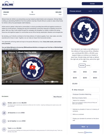
For example, take a look at Airlink’s Donorbox-hosted donation page below. It clearly communicates their mission, has a goal meter to share real-time progress, and is branded to build donor trust.
When you provide donors with a giving experience that is seamless and signals trust, you’ll close the loop and increase the donor lifetime value.
The Hidden Cost of “Good Enough”
As a nonprofit leader, you’re constantly grappling with the burden of overhead costs. This can make low-cost and zero-fee platforms look very attractive in the moment.
The reality is that settling for a platform that’s “good enough for now” often means your donors and their experience ultimately end up paying the price.
A complicated, frustrating donor experience can lead to:
- More abandoned gifts
- Lower conversion rates
- Fewer recurring donors
- Reduced donor trust and confidence
- Lower donor lifetime value
Sure, fees are an important factor to consider when shopping for a fundraising platform. But it shouldn’t take precedence over your donors’ experience – and expectations. After all, your supporters are the lifeblood that fuels your mission.
A professional donation page should make giving feel intuitive and natural. That’s how you’ll reassure donors that you value their time and money, and take their trust seriously.
How to Build a Trust-Inspiring Donation Page
Your donation page doesn’t need to be complicated or flashy to ensure donors feel confident, secure, and connected to your mission from the moment they arrive.
Modern fundraising platforms like Donorbox make it easy for you to quickly set up secure, branded donation pages that build donor confidence and encourage long-term support.
When evaluating the donation experience, ask whether your chosen platform allows you to:
- Customize donation pages and forms to match your brand and website
- Share your story and fundraising impact through text and visuals
- Display goal meters and campaign updates to increase transparency
- Add trust badges to reinforce credibility
- Offer recurring giving options that are easy to set up and manage
- Support multiple payment methods and one-click giving
- Optimize the donation experience for mobile and desktop users
- Include donation designations so donors know how their funds are being used
- Protect sensitive information with secure payment processing and fraud prevention measures
- Collect and manage donor data
- Send personalized, automated donation receipts once a supporter gives
- Provide access to a donor portal to manage recurring plans and access receipts
In the end, supporters want to feel connected to your mission and be able to donate quickly and easily. Your donation page may be their first interaction with your organization, and it can significantly impact whether they choose to give – and give again.
Closing Thoughts
Your donation page is more than just a fundraising tool. It’s a reflection of your leadership and how much you value and respect the donor experience.
As a nonprofit leader, it’s worth asking:
“Does the donation experience we offer inspire trust or cause hesitation?”
A thoughtful, frictionless giving experience and trust signals show donors you respect their time and value their support – and that’s how you’ll capture lasting generosity.
Need a second opinion on your donation page? I’d love to connect and review your materials. Email me at rob@robharter.com.